
Your Brand’s Visual Flavor: Color, Texture & Mood—The Secret Sauce of Crave-Worthy Content

Alright, let’s be real—food photography isn’t just about making stuff look “yum.” It’s about grabbing eyeballs, stoking cravings, and making your brand feel like a vibe, not just a menu. We’re talking visual flavor—that full send of emotion, color, mood, and mouthfeel that hits before the first bite.
Color: The Appetite Hype Machine
Color’s the first thing your audience notices, and it’s packing more psychological power than your old school neon surfboard wax.
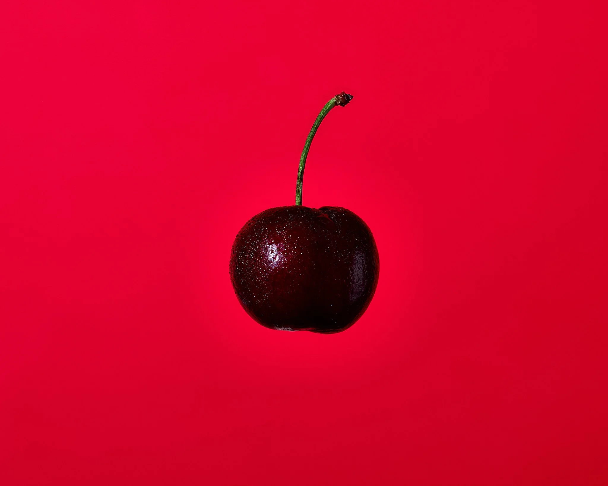
Warm tones - reds, oranges, yellows
They scream heat, spice, boldness.

Cool tones - blues, greens, purples
Chill vibes, clean eats, that fresh-from-the-earth feeling.

High VS Low Saturation and Contrast
High saturation is your loud friend in the room—it grabs attention and doesn’t ask permission. Muted tones are the cool, quiet kid with mysterious depth.
Fun fact
Most folks already “taste” your food the second they see it. Red signals sweet. Green whispers clean. It’s mind games meets appetite.
(Free Pro Tip : Create a color cheat sheet for your brand. It’s like building a flavor map but for the eyeballs)
Texture: More Than Just Crunch

If color’s the vibe, then texture’s the grit—the surf wax, the snowpack, the grit under your boots. It’s what makes a photo feel real.
You want crackly crusts, sticky glazes, steamy noodles with wild movement.
Or go off-script with halftone shadows, extra grain, or punchy contrasts that feel like Warhol meets food truck magic.
Texture isn’t just surface. It’s storytelling. It says: “This dish slaps,” or “Yeah, you wanna dive face-first into this donut.”
Mini Mission
Check your latest shots. Can you feel them with your eyeballs? No? Time to pump the contrast and crank the drama.
Visual Flavor Checklist:
Are You Hitting or Missing?
Let your followers taste your brand before they read the caption. Here’s a lightning-fast checklist:
Do your colors match the emotion you want to spark?
Is your lighting clean, loud, or moody—and is it on purpose?
Are textures juicy, flaky, melty, or just… meh?
Does your composition scream “this brand knows what’s up”?
Are you evoking curiosity, hunger, or comfort before they even scroll?
If you’re not sure where your brand falls, take my “Discover Your Brand's Visual Identity Impact” quiz now
Bonus: If you’re falling short, don’t stress. I’ve got a few freebies to boost your visual flavor right now.
Flavor Boosters for the Bold & Brilliant
Mood Board Binge: Build a vibe deck with color combos, textures, lighting, fonts, and inspo. Keep it handy before every shoot. It’s like setting your creative GPS.
Overlay Madness: Try bold shadows, halftone layers, or color pops on your headers or thumbnails. It’s quick seasoning for your style.
Shoot with a Word: Pick an emotion before each shoot—“cozy,” “chaotic,” “edgy,” “sunny.” Let that word guide your styling and angles.
Texture Challenge: Re-shoot a dish with exaggerated texture. Think crumbs that look like surf spray. Get weird.
Caption Chemistry: Pair visuals with flavor-language. Say it like you mean it: “Bite-sized firecracker,” “That saucy swirl’s got attitude,” “You can hear the crunch.”
Wanna Go Deeper? Workshops with Bite.
This blog’s just the snack-size sampler. If you’re ready to cook up visuals that actually say something, I run workshops that break it all down: Color psychology, texture theory, mood mapping, shooting techniques, and a whole lotta artistic flavor.
Whether you're snapping for your own brand, shooting for clients, or just vibing your way into the food photography universe—these workshops serve the goods.
What to expect:
Hands-on styling labs
Real-time feedback
Visual strategy breakdowns
A healthy dose of bad puns and snack breaks
I keep it spicy, irreverent, and precision-packed. Drop in, level up, and leave with visuals that Rock harder than a 90s Music video.
Workshop schedule + sign-up info lives
Don’t be late—unless you're bringing donuts.